Listen
Follow the client’s knowledge of his adult audience instead of forcing a fashionable visual style onto the brand.

Packaging design · label system · product copy
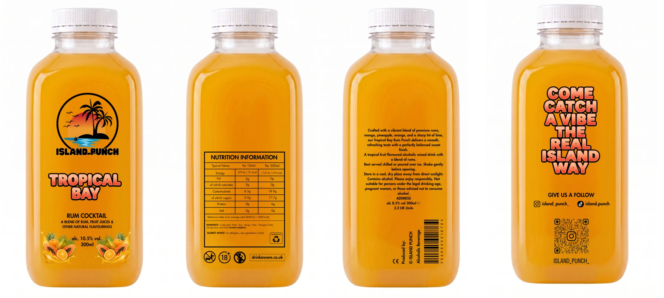
Brand direction · packaging structure · compliance-aware copy
Island Punch is a UK rum-punch range made for social occasions and a younger adult audience. The brief called for bold flavour names, immediate fruit cues and the kind of energy that can register quickly in a busy setting.
My first instinct was cleaner and more minimal. The client knew that was not the world his customers responded to, so I changed direction. The work became an exercise in listening closely, separating personal taste from commercial usefulness, and making the client’s intended character work consistently.
01
Colour · naming · fruit cues · shelf impact
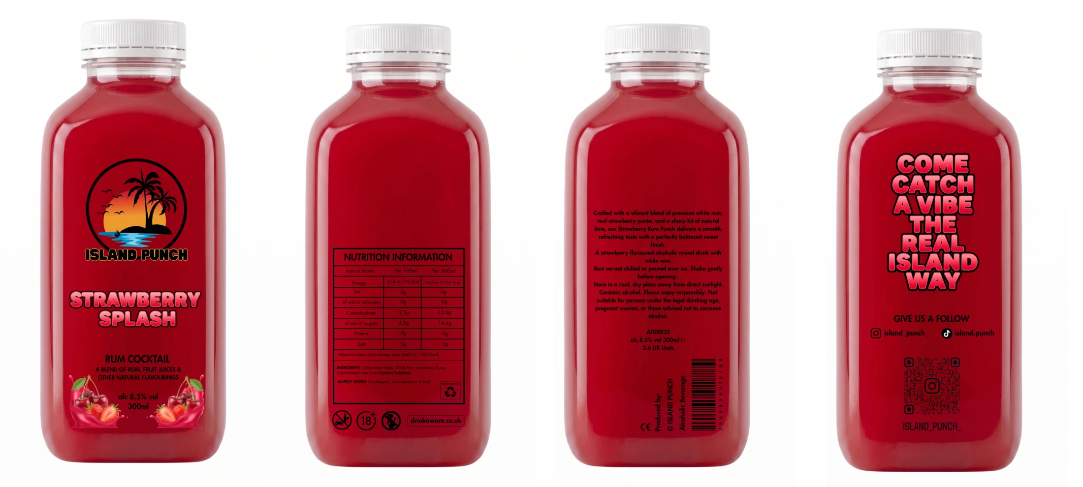
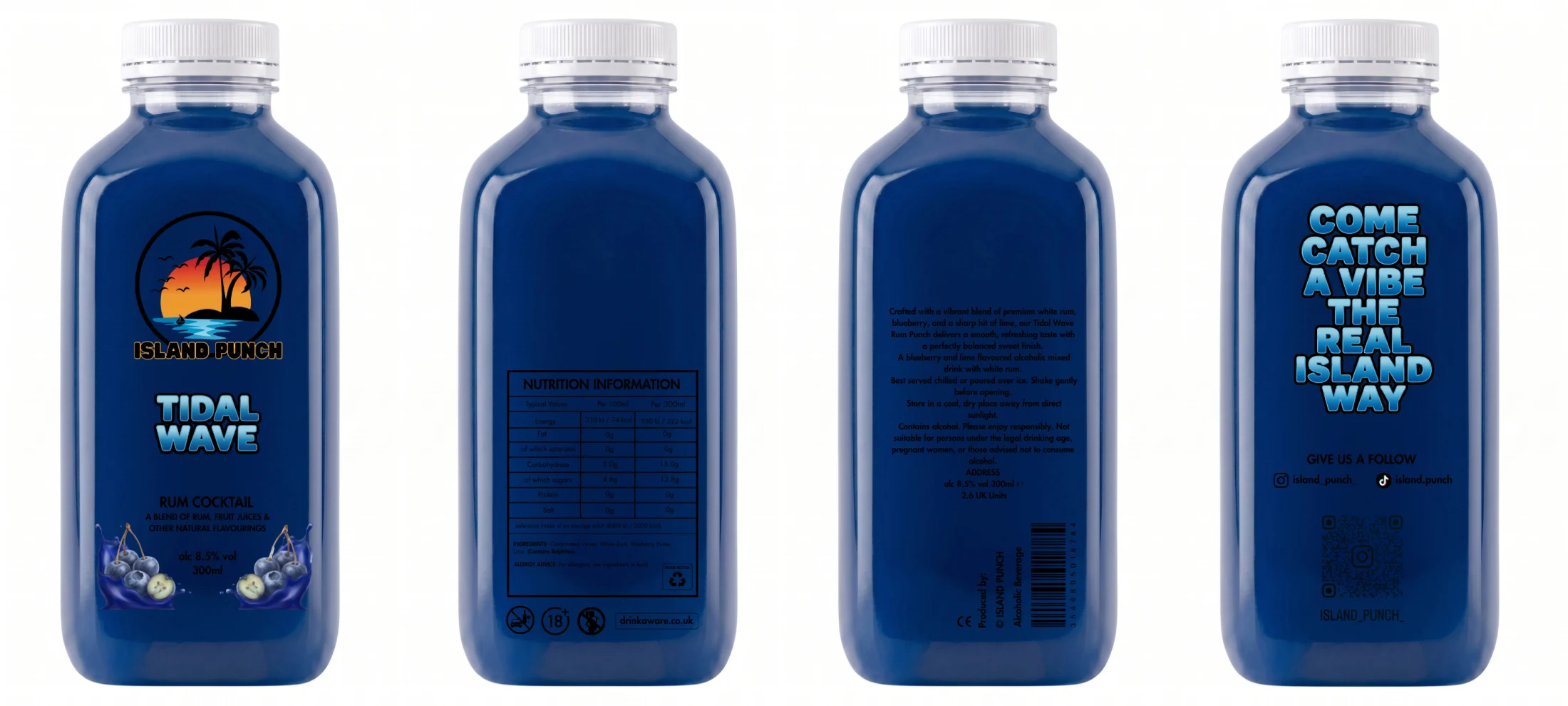
The strong colour fields, fruit imagery and direct names make each bottle easy to distinguish at a glance. Strawberry Splash and Tidal Wave feel different immediately, but their logo position, product description and label rhythm keep them visibly part of the same family.
That balance matters across a growing range: enough variation to make choosing feel easy, with enough structure that a new flavour never has to begin from zero.
02
Identity · product information · responsibility · social
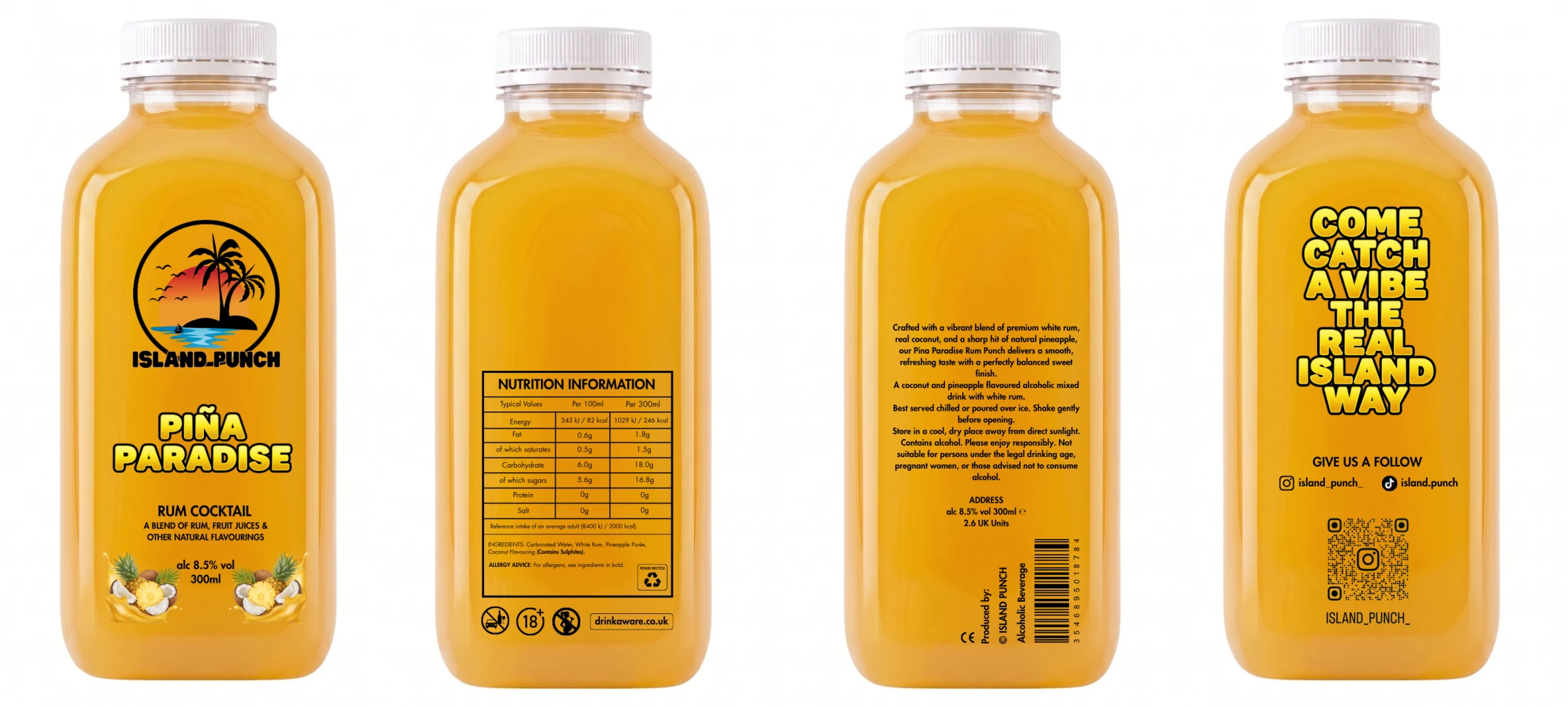
Each board brings the full bottle together: a front face for recognition, structured product information, longer serving and storage copy, and a social panel with campaign language and a QR route.
I researched UK alcohol-labelling expectations and translated them into a consistent working structure for ABV, volume, UK units, nutrition, ingredients, allergen emphasis and responsible-drinking language. I also developed the customer-facing descriptions and serving copy, then arranged every part so the bottle could remain energetic without making essential information hard to find.
The work was prepared with compliance-aware research; final regulatory and print approval sits with the producer and relevant specialists.
03
One framework · nine expressions
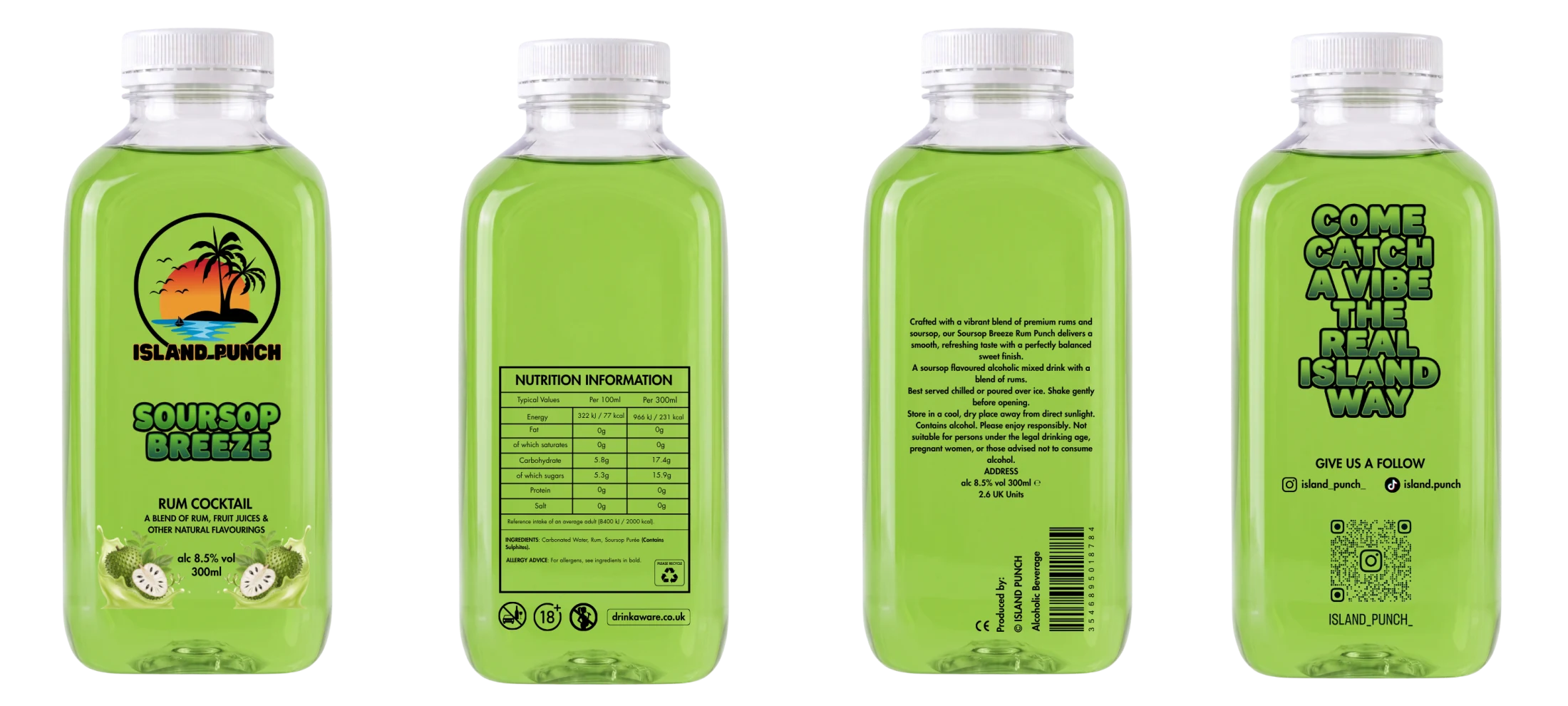
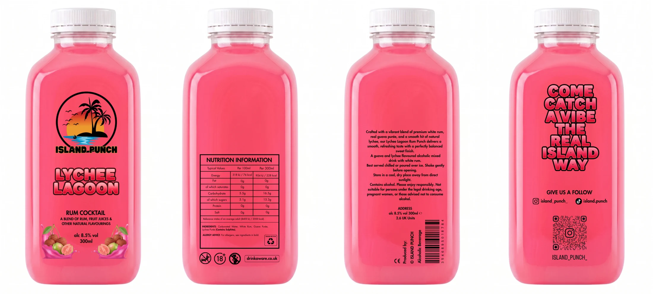
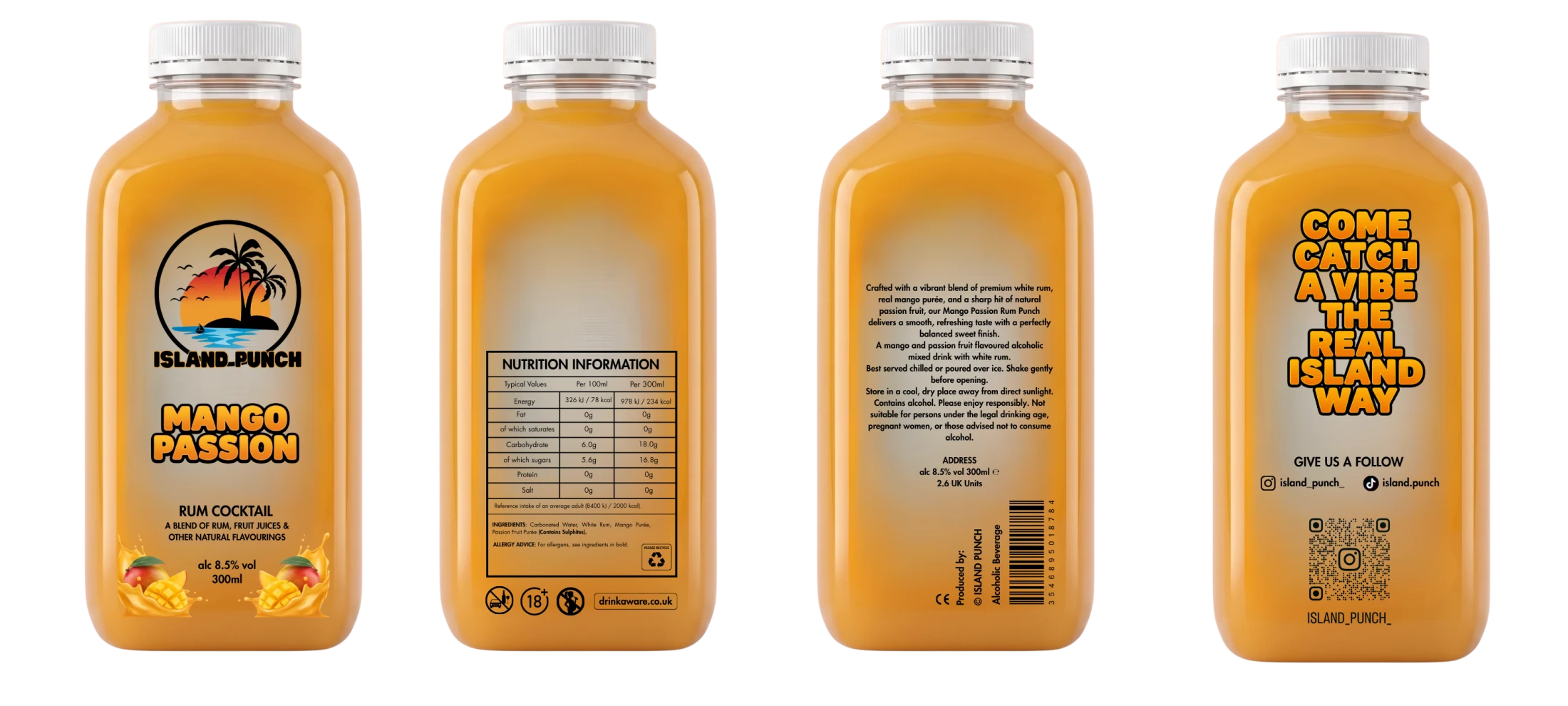
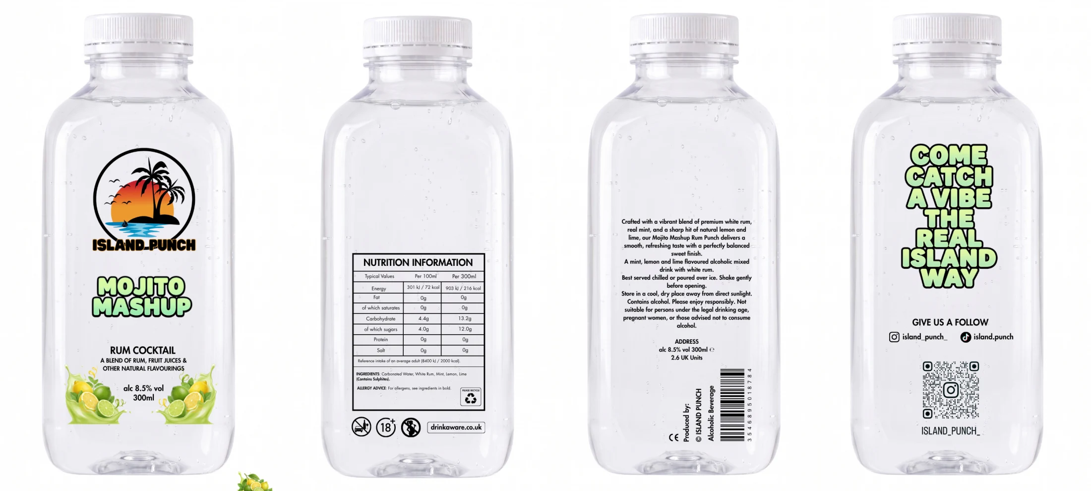
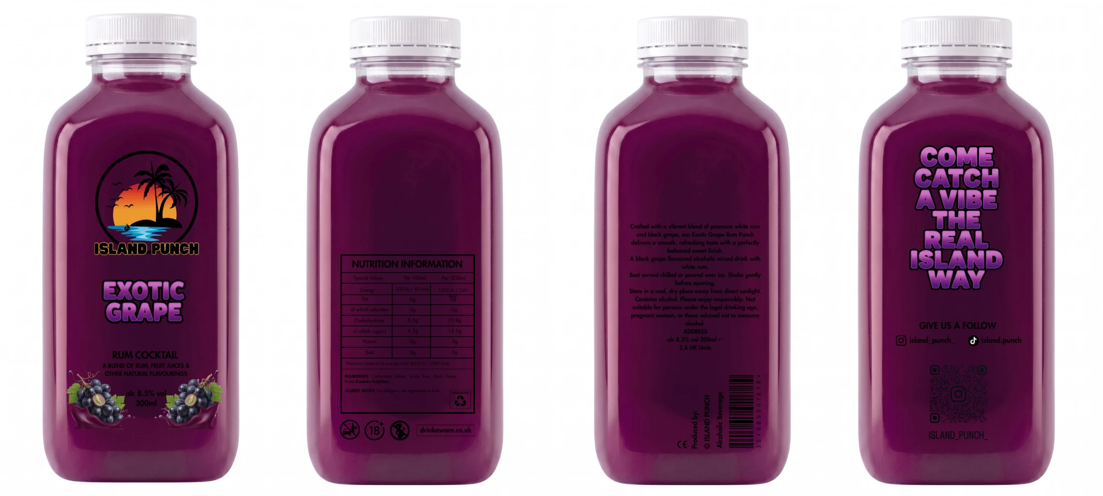
The repeated framework gives the range a stable foundation. Product names can become louder, colours can change completely and the fruit story can shift, while the information architecture remains dependable.
This was packaging, copywriting and production thinking in one project. I learned the category as I worked, responded quickly to real client feedback and turned individual bottles into a system the brand can continue to use.
Follow the client’s knowledge of his adult audience instead of forcing a fashionable visual style onto the brand.
Bring identity, product copy and compliance-aware information into one repeatable label format.
Give every flavour its own personality while keeping future additions recognisably Island Punch.
Nine label boards, one connected packaging system.